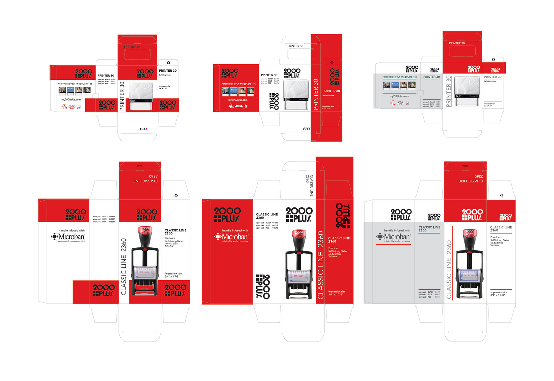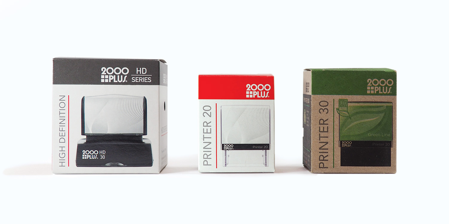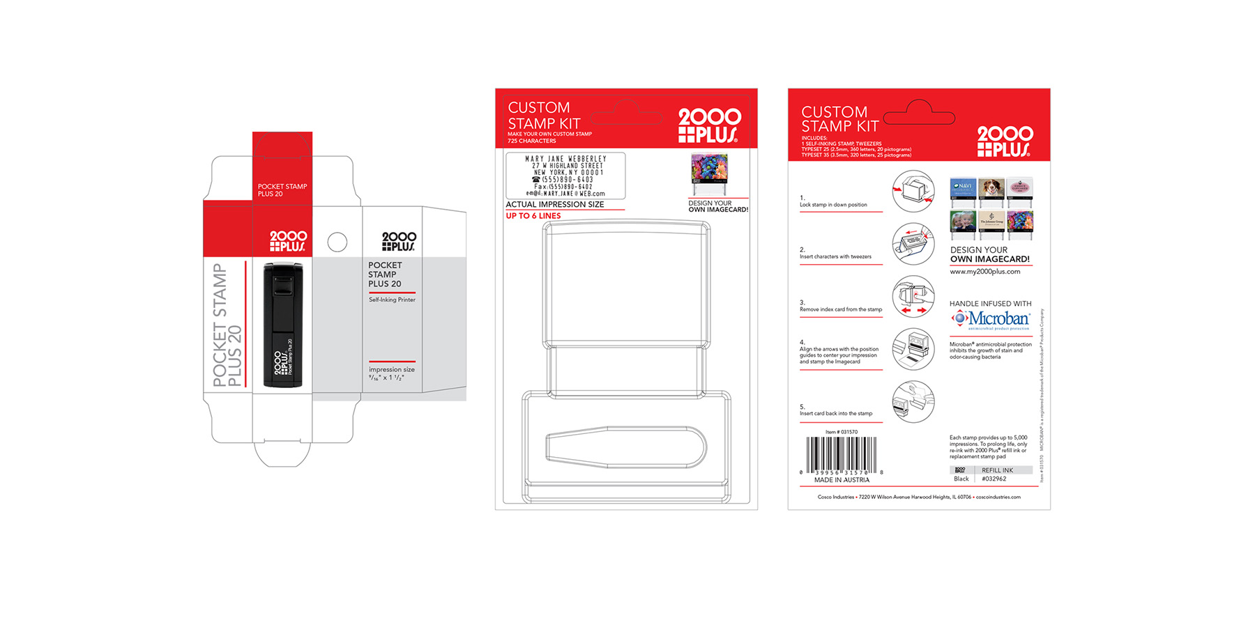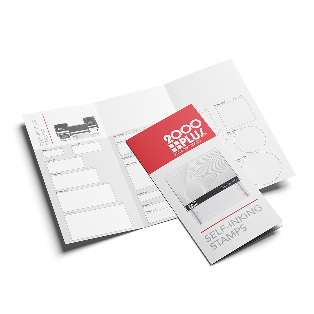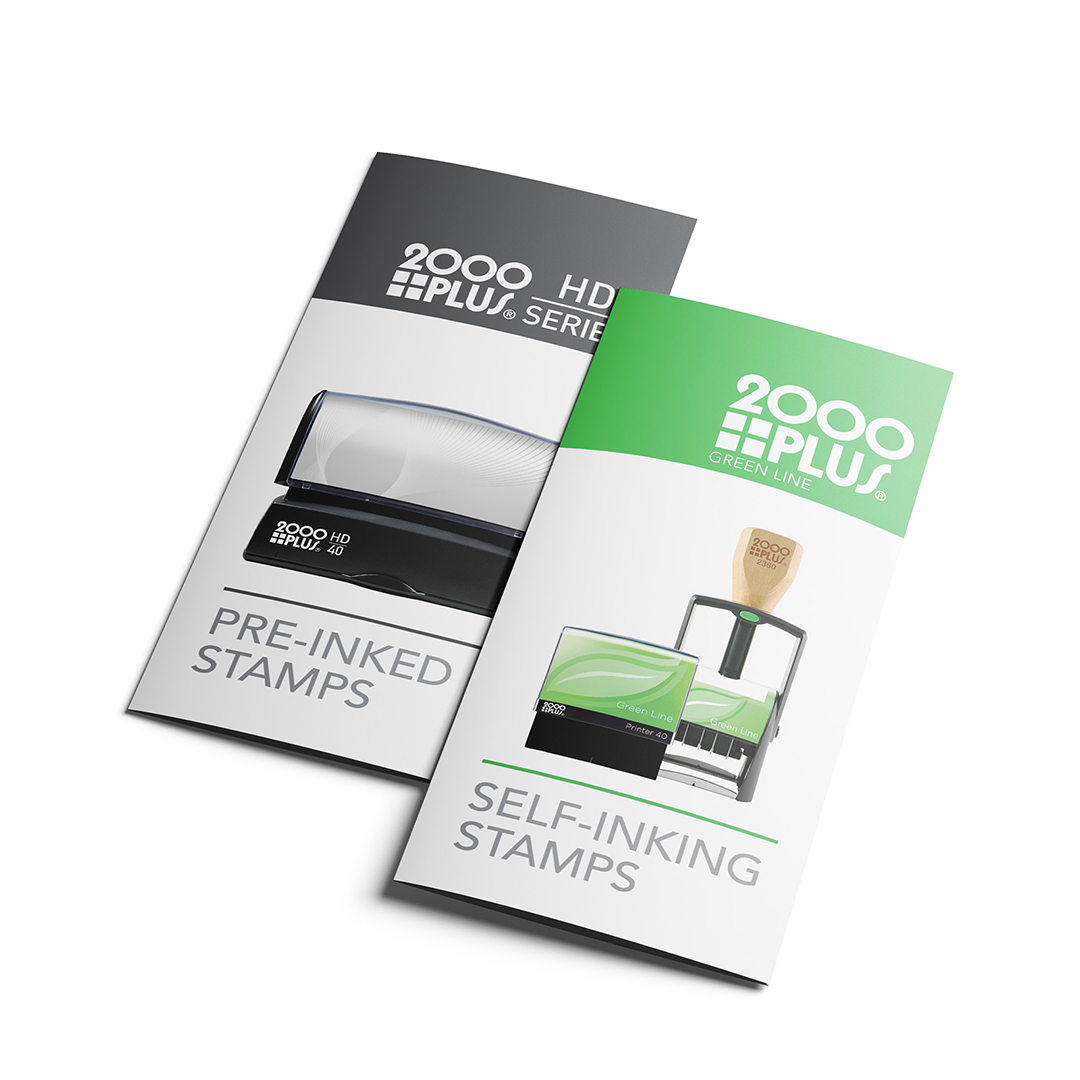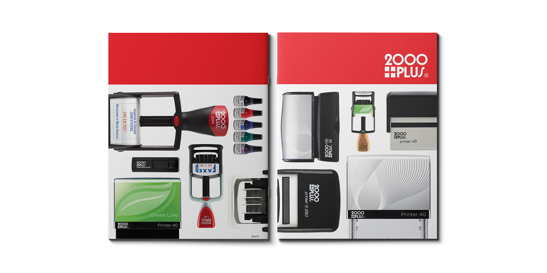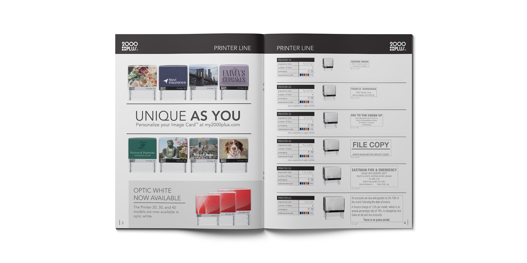


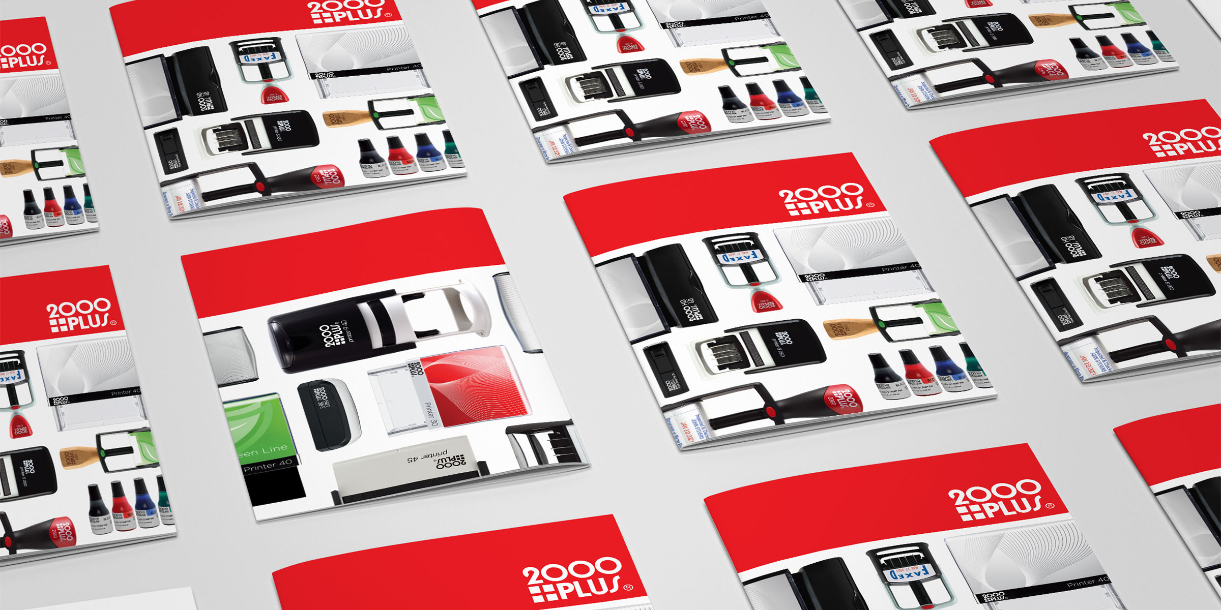
Previously, while the 2000 Plus brand carried a variety of stamp lines, each stamp carried its own brand visuals united only by a logo, creating a fractured brand image. The redesign of the most popular stamps in the Printer Series required creating new materials for the line as well as updates to include the redesign in past materials. That made for the perfect moment to strengthen 2000 Plus as a brand by unifying all stamp lines under a single visual umbrella.
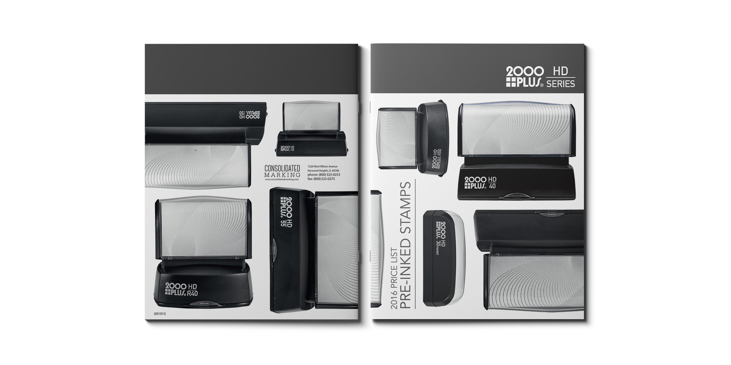
Only keeping the original logo, a visual design was developed with a simple and modern style that used color blocking previously used in prior catalogs for a striking way to distinguish different stamp lines. Further using the geometric look of the front-facing photography, a mosaic presentation of various stamps was used to create a dynamic and eye-catching cover.
Two years after the roll out of this visual system, a stamp line that had previously been branded separately was folded into the 2000 Plus as the HD line. Switching the main color to dark grey was a simple way to separate this product category from the main line while still keeping the same overall brand look.
